Last month I critiqued my two Vox department spreads...this month I've got two single pages to share with you (photos to come).
The first one here is probably the quickest I've ever completed a department page. I suppose it's just one of those weeks when it all plays out well with the text, art, headline and ads. I was definitely grateful for that!
The second was a bit of a predicament because the story turned out to be such an awkward length given the quarter-page ad that was on it (yes, I know they're necessary -- but still don't have to like them) and that both the recurring sections were too long to fit in the excessive amount of white space I had. But I think it all worked out pretty great!
Only one more department to design for Vox -- it's been a great semester!

Showing posts with label Critique. Show all posts
Showing posts with label Critique. Show all posts
Wednesday, April 27, 2011

Wednesday, April 20, 2011
Critique...being commissioned for work!
The illustration assignment has finally come around for the beginning design students this spring. For all of us that want to be designers it's a chance to do something completely crazy and unique -- but for the writers and editors in the class it's the kiss of death. Silver lining? They get the chance to in creative director's position and commission a designer to create their illustration.
The following is the illustration I created for a friend of mine. She did a great job as creative director and sat with me the whole time as I created the illustration. Her abilities to voice her opinions and give creative suggestions were impressive considering she didn't feel she had any creative talent.

The story is about college graduates that don't complete their full professional "evolution" -- rather than getting a job after graduation, getting married and having kids -- more and more college graduates are seeking other paths.
The following is the illustration I created for a friend of mine. She did a great job as creative director and sat with me the whole time as I created the illustration. Her abilities to voice her opinions and give creative suggestions were impressive considering she didn't feel she had any creative talent.

The story is about college graduates that don't complete their full professional "evolution" -- rather than getting a job after graduation, getting married and having kids -- more and more college graduates are seeking other paths.
Wednesday, April 13, 2011
Critique...Shindig is coming close to the end!
With next week being the final week that we will be working on our commissioned pieces, I thought it would be nice to critique what we've ended up with! We've all being working extremely hard on our designs and I think we're all looking forward to seeing the final pieces after they've been printed.
Departments
Cheers, Baking with Booze: After a bit of concern about how many recipes we were planning on including and then determining the art (it's always the art that seems to be the issue) we landed on three awesome recipes and some great photos, including one I shot myself (a unique, textured border for the top of the right page).
Feast, Basket Case: This spread was definitely not a picnic, but it is one of our most well written pieces from the entire magazine. One difficultly we've had in discussion with our publishers is how reasonable it would be to find artwork for our spreads when we are given very little resources outside of the photo database we are granted permission to and actually shooting the photographs ourself.
Mingle, Hostess Guide: Vintage was our goal and, with the help of Etsy.com, we were able to find great art for our hostess gifts and as I see it, the spread turned out a lot like a product spread I would see in a department of a real magazine.
Flair, Make It or Break It: This is BY FAR my favorite of all the spreads I designed for Shindig. The photo, taken by me, turned out exactly how I had pictured it in my head. I'm not sure about everyone else, but rarely does it actually turn out how I see it in my head.
Features
Luxe for Less: Lucky us! We found a wine bottle that fit our design needs perfectly. Because, while Photoshop is a wonder and I'm sure I have much to learn about it's capabilities -- I am not a wiz at turning a standard wine bottle into a silver and black one. I say lucky us, because we happened to find one while at one of our photo shoots for the project! That addition to the spread, and a change of color palette completely transformed this piece into another one of my favorites.
Game On: Unfortunately, we got the text for this piece a little late, so we're running behind on the designs, but they're going well and will definitely be ready come the end of next week!
Photos to come after we've submitted our final pieces!!
Departments
Cheers, Baking with Booze: After a bit of concern about how many recipes we were planning on including and then determining the art (it's always the art that seems to be the issue) we landed on three awesome recipes and some great photos, including one I shot myself (a unique, textured border for the top of the right page).
Feast, Basket Case: This spread was definitely not a picnic, but it is one of our most well written pieces from the entire magazine. One difficultly we've had in discussion with our publishers is how reasonable it would be to find artwork for our spreads when we are given very little resources outside of the photo database we are granted permission to and actually shooting the photographs ourself.
Mingle, Hostess Guide: Vintage was our goal and, with the help of Etsy.com, we were able to find great art for our hostess gifts and as I see it, the spread turned out a lot like a product spread I would see in a department of a real magazine.
Flair, Make It or Break It: This is BY FAR my favorite of all the spreads I designed for Shindig. The photo, taken by me, turned out exactly how I had pictured it in my head. I'm not sure about everyone else, but rarely does it actually turn out how I see it in my head.
Features
Luxe for Less: Lucky us! We found a wine bottle that fit our design needs perfectly. Because, while Photoshop is a wonder and I'm sure I have much to learn about it's capabilities -- I am not a wiz at turning a standard wine bottle into a silver and black one. I say lucky us, because we happened to find one while at one of our photo shoots for the project! That addition to the spread, and a change of color palette completely transformed this piece into another one of my favorites.
Game On: Unfortunately, we got the text for this piece a little late, so we're running behind on the designs, but they're going well and will definitely be ready come the end of next week!
Photos to come after we've submitted our final pieces!!
Wednesday, April 6, 2011
Critique...Spring Break Typography
As I've mentioned before and I'll mention again, I want to live in New York City more than any other place on earth...so it's no surprise that I chose to spell out "New York City" for our spring break typography assignment.
 The way I see it...the photos may have been taken in Chicago and spell New York, but it reflects me because I will find a way to make a life for myself in New York despite being a Chicago girl at heart.
Here are the originals from the typography assignment:


Here are the originals from the typography assignment:


Tuesday, March 22, 2011
Critique...Vox Departments So Far
My first weekend designing for Vox Magazine was rather stressful -- as if not knowing what I was doing wasn't enough, I spent 48 hours freaking out about an illustration that I was supposed to make for the online version of the story I had to design. I didn't know the game in the story and the reporter was refusing to speak to me. I finished the following flash graphic (below is a photo, not the graphic) for the story and the page design, to come to find out there was an ethical issue -- the story wasn't printed and neither was my graphic. I still plan to use it in my portfolio.

Second round of Scene designing went a lot smoother -- though having my feature the same weekend did make it a bit crazy. It was fun, though, I enjoyed getting through all the stories and piecing it all together.


Third round of Vox designing was another splash of change with the travel issue -- which was definitely a good time -- but when were told to stick with the personality of Vox in our designs it's hard to keep consistent when we only design every three weeks. Over all, this third week was my favorite because it was my type of content. I love to travel and it made me think of the idea that some day I could be designing for a travel publication's department pages.


Wednesday, March 16, 2011
Critique...Logos Through the Drafts
The number 20 didn't seem that big when it was my age or when it was the number of miles I'd driven on my 432-mile drive home, but designing 20 logos is a lot harder than I expected. In hours I spent on designing my first drafts I came up with a handful right off the bat; I thought I was home-free -- I still had 14 more to design. I stuck with the color red in my first drafts because I've grown up visualizing black and red as a combination of colors that were bold...strong...unbreakable. And when I think of the women and minorities that the Sports Journalism Institute support, I can only imagine how tough they've got to be to make their careers happen. So here's what I started with:

Round two we were told to narrow the field to five logos. The following were my top five and how they changed from the original drafts to the final five. Note: the ORIGINAL is on the far left of each.
Choice 1: Received 2 votes during the in-class selection.

Choice 2: Received 5 votes during the in-class selection.

Choice 3: Received 9 votes during the in-class selection.

Choice 4: Received 4 votes during the in-class selection. As you can see, I opted for a brand new logo -- I now think they look like baby rattles.

Choice 5: Received 3 votes during the in-class selection.

And in the final drafts our five selections were brought to two choices with the help of Greg Bowers.
Choice 1: For this logo I wanted to take on the image of designing a seal for the institute, because when I think of an institute I think they must have a seal of some sort -- University of Missouri has one, it's displayed in the Student Center as a remembrance of Brady Commons.

Choice 2: Sports are all about motion -- there's constant movement, even when athletes take a moment to breathe. I designed this logo around that motion and took into effect the way the motion encircles the team; hence, the motion is encircling the name plate. As for color (in both logos), I was told that symbolism was not as powerful as color -- so I chose colors that were vibrantly different, dark with contrast, and lastly a resemblance of skin colors.


Round two we were told to narrow the field to five logos. The following were my top five and how they changed from the original drafts to the final five. Note: the ORIGINAL is on the far left of each.
Choice 1: Received 2 votes during the in-class selection.

Choice 2: Received 5 votes during the in-class selection.

Choice 3: Received 9 votes during the in-class selection.

Choice 4: Received 4 votes during the in-class selection. As you can see, I opted for a brand new logo -- I now think they look like baby rattles.

Choice 5: Received 3 votes during the in-class selection.

And in the final drafts our five selections were brought to two choices with the help of Greg Bowers.
Choice 1: For this logo I wanted to take on the image of designing a seal for the institute, because when I think of an institute I think they must have a seal of some sort -- University of Missouri has one, it's displayed in the Student Center as a remembrance of Brady Commons.
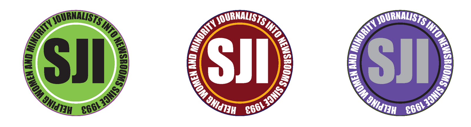
Choice 2: Sports are all about motion -- there's constant movement, even when athletes take a moment to breathe. I designed this logo around that motion and took into effect the way the motion encircles the team; hence, the motion is encircling the name plate. As for color (in both logos), I was told that symbolism was not as powerful as color -- so I chose colors that were vibrantly different, dark with contrast, and lastly a resemblance of skin colors.

Monday, March 7, 2011
Critique...Cover Competition 2
I was excited about the fact that I would get to work on the cover competition for the travel issue -- my ultimate goal with my career is to work for a travel publication. What was difficult was thinking so locally, because when I think about travel and where it can take me. It's hard for me to think that traveling could mean less than 100 miles.
Here's what I came up with:

For my first cover I was inspired by the idea that we all relate spring break with jet setting to some place far from the reality we live in for most of our year. I chose the image I did because the child brought the family aspect of traveling from the stories in the issue.

The second cover I took special interest in the road trip feature story. I wanted the give the idea that we can vacation only a short drive away. It was a great photo -- though I understand where the editors were coming from with respect to the landscape in the mirror.

The third cover was my favorite...although it wasn't a favorite of the editors. I understand that passports are for world travel -- but one of the story titles on the DTS had something to do with the world of Missouri. So I thought the passport stamps could be from Missouri.
Here's what I came up with:


The second cover I took special interest in the road trip feature story. I wanted the give the idea that we can vacation only a short drive away. It was a great photo -- though I understand where the editors were coming from with respect to the landscape in the mirror.

The third cover was my favorite...although it wasn't a favorite of the editors. I understand that passports are for world travel -- but one of the story titles on the DTS had something to do with the world of Missouri. So I thought the passport stamps could be from Missouri.
Wednesday, March 2, 2011
Critique...App Development, outside class
This week I didn't have anything in the way of Vox, our prototype projects, or any other assignment to critique this week -- so I took a que from Ashley and decided to critique the wireframes I designed for my app development course.
At little overview on the project, first. My group is working on an application for the MU Museum of Art & Archaeology. We are going to create an image driven application (as opposed to map-driven) that will divide the museum into its historical and artistic exhibits. Everything will be based on a short tour, with links for a longer tour if they wish - essentially the user will be able to choose what kind of experience they have. We are planning on creating a four-button application that will lead to (1) contact information and hours and will include a link to donate to the museum, (2) main content of the app (exhibits), (3) a map of the museum and (4) an events page that will link to either MU events or the museum’s facebook events page. The main content of the app will include a shortened versions of the museum’s already existent 40-minute podcast, a gallery featuring some of the museum’s more visually striking pieces and we'll feature pieces, such as very small coins, that the technology can showcase better than the museum itself can. Some pieces will also include additional information such as similar pieces elsewhere and random tidbits, such as information about the artist.
Check out the first wireframes I put together:


Creating the wireframes were a lot less difficult than I expected -- though having templates for creating them made it that much easier. I didn't expect there to be so little design work in developing an app -- but I suppose simple is always better.
At little overview on the project, first. My group is working on an application for the MU Museum of Art & Archaeology. We are going to create an image driven application (as opposed to map-driven) that will divide the museum into its historical and artistic exhibits. Everything will be based on a short tour, with links for a longer tour if they wish - essentially the user will be able to choose what kind of experience they have. We are planning on creating a four-button application that will lead to (1) contact information and hours and will include a link to donate to the museum, (2) main content of the app (exhibits), (3) a map of the museum and (4) an events page that will link to either MU events or the museum’s facebook events page. The main content of the app will include a shortened versions of the museum’s already existent 40-minute podcast, a gallery featuring some of the museum’s more visually striking pieces and we'll feature pieces, such as very small coins, that the technology can showcase better than the museum itself can. Some pieces will also include additional information such as similar pieces elsewhere and random tidbits, such as information about the artist.
Check out the first wireframes I put together:


Creating the wireframes were a lot less difficult than I expected -- though having templates for creating them made it that much easier. I didn't expect there to be so little design work in developing an app -- but I suppose simple is always better.
Wednesday, February 23, 2011
Critique...Feature Final Draft
All I have to say in the way of designing a Vox feature: TALK TO YOUR EDITORS! Trust me, it makes designing the pages so much easier. After reading through a number of the vignettes I was having such a difficult time coming up with a cohesive design for Dirty Jobs -- which ended up as Gross Incomes. However, after speaking with Rob and Ali via email and grounding my thoughts I was able put together a draft that the editors recognized as a difficult task that I had a good start on.
It was a great experience to work on this particular feature, because it wasn't straight forward -- a single story with a set of photos to match. It was a challenge to see the connections, display prominence and work with a total number of stories changing multiple times over the course of the design process.
In the end, I think my second feature turned out well! It's a great piece for my portfolio.


It was a great experience to work on this particular feature, because it wasn't straight forward -- a single story with a set of photos to match. It was a challenge to see the connections, display prominence and work with a total number of stories changing multiple times over the course of the design process.
In the end, I think my second feature turned out well! It's a great piece for my portfolio.


Tuesday, February 15, 2011
Critique...Prototype, the First Draft
This first draft is not as elaborate as I would have liked it to be -- to be honest, I had so many ideas that I didn't know what to do with my ideas. I flipped through a number of different magazines and researched online but it was had to select a design feature that fit my vision. Luckly -- this is just a first draft and I will be dedicating my entire weekend to elaborating on my vision for the formal presentation next week.
Color Palette: When both of our groups came together to discuss what we wanted for the magazine we knew we wanted to focus away from how clean cut Real Simple is in there design, but not to take it to the extreme of a craft/scrapbook design. Thus I selected some bold colors that offered a bit of a mellow side as well. I am a girl that loves color, so I avoided shades of the same color.

Cover 1: Of the two features that our publishing group came up with, my favorite was the idea of a portable party -- or a destination party. Thus, my cover design/photo is inspired by their suggestion of a rooftop party. If given the option of working with a photographer and actually shooting a rooftop party I would have liked to have people actually in the photo, but in my search for the perfect cover photo all those with people in them were not classy enough for a cover.

Cover 2: Their second suggestion was for digital invitations -- a wonderful story idea, but more difficult to translate into a cover then I thought. I know I have a way to go on translating this correctly, but here is my though process on this cover: using a paper invitation on the cover and on the spread, recreating the paper invitation for digital distribution.

Feature Spread: This feature spread is meant to go with the first cover I designed. Each of a number of spreads would show the read how to put together a different "portable" party -- i.e. the beach, a rooftop, tailgate party, etc. My sidebar needs a lot of work -- but what I got to before the midnight deadline was to include a center piece, a party favor and (although I don't have it on my spread here) a food item. In addition, for other spreads of the feature I thought it would be good to have a sidebar on a possible party game/activity.

Department Page: Cheers! This was my favorite page to design, because -- regardless of whether we want to admit it -- what we are drinking at a party can be more important than anything else about the party.

Between my feature and department pages I kept the design element of the six overlapping circles in an effort to suggest that everything has an overlapping connection within a plan/presentation of a party -- an in itself, everything comes full circle from the start to the finish of a party.
Color Palette: When both of our groups came together to discuss what we wanted for the magazine we knew we wanted to focus away from how clean cut Real Simple is in there design, but not to take it to the extreme of a craft/scrapbook design. Thus I selected some bold colors that offered a bit of a mellow side as well. I am a girl that loves color, so I avoided shades of the same color.

Cover 1: Of the two features that our publishing group came up with, my favorite was the idea of a portable party -- or a destination party. Thus, my cover design/photo is inspired by their suggestion of a rooftop party. If given the option of working with a photographer and actually shooting a rooftop party I would have liked to have people actually in the photo, but in my search for the perfect cover photo all those with people in them were not classy enough for a cover.

Cover 2: Their second suggestion was for digital invitations -- a wonderful story idea, but more difficult to translate into a cover then I thought. I know I have a way to go on translating this correctly, but here is my though process on this cover: using a paper invitation on the cover and on the spread, recreating the paper invitation for digital distribution.

Feature Spread: This feature spread is meant to go with the first cover I designed. Each of a number of spreads would show the read how to put together a different "portable" party -- i.e. the beach, a rooftop, tailgate party, etc. My sidebar needs a lot of work -- but what I got to before the midnight deadline was to include a center piece, a party favor and (although I don't have it on my spread here) a food item. In addition, for other spreads of the feature I thought it would be good to have a sidebar on a possible party game/activity.

Department Page: Cheers! This was my favorite page to design, because -- regardless of whether we want to admit it -- what we are drinking at a party can be more important than anything else about the party.

Between my feature and department pages I kept the design element of the six overlapping circles in an effort to suggest that everything has an overlapping connection within a plan/presentation of a party -- an in itself, everything comes full circle from the start to the finish of a party.
Subscribe to:
Posts (Atom)