Wednesday, April 20, 2011

Critique...being commissioned for work!

The illustration assignment has finally come around for the beginning design students this spring. For all of us that want to be designers it's a chance to do something completely crazy and unique -- but for the writers and editors in the class it's the kiss of death. Silver lining? They get the chance to in creative director's position and commission a designer to create their illustration.

The following is the illustration I created for a friend of mine. She did a great job as creative director and sat with me the whole time as I created the illustration. Her abilities to voice her opinions and give creative suggestions were impressive considering she didn't feel she had any creative talent.


The story is about college graduates that don't complete their full professional "evolution" -- rather than getting a job after graduation, getting married and having kids -- more and more college graduates are seeking other paths.

Wednesday, April 13, 2011

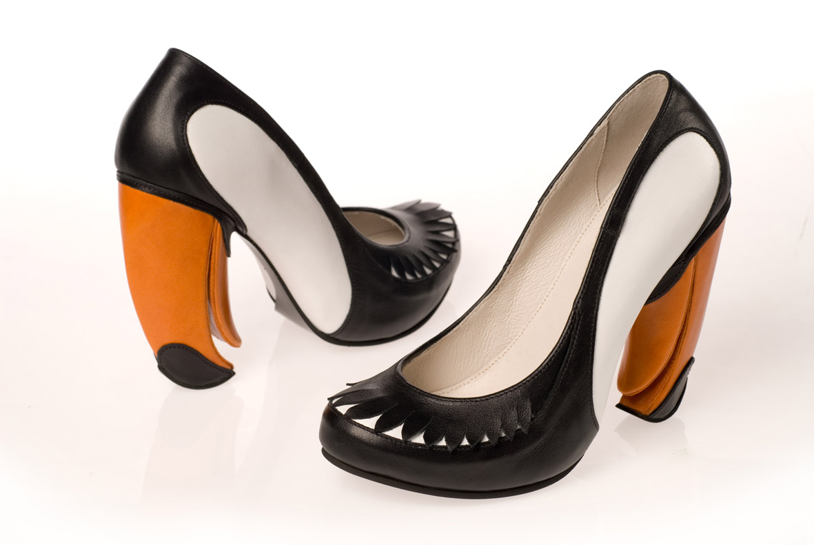
You Can't Miss...Heel Art

This week I took a break from my normal following of Smashing Magazine, because I can't help but share Kobi Levi's blog featuring her unique high heel designs. It amazes me when I realize that so much of everyone's life is determined by a designer -- the clothes/shoes we wear, the buildings we learn and work in, the cars we drive to get places...and, of course, the magazines we read obsessively!


Response...Mini Portfolios

I think it's wonderful that we're getting the opportunity to create these mini portfolios. To be honest, I had never heard of a mini portfolio before -- which is probably another reason it's great I'm in this capstone course. We all have worked really hard on all of our work, and being able to compile it all together in another place -- other than a pile in our rooms or files on our computers.

It was really great to see other mini portfolios from semesters past, because it's true that all of our greatest was inspired by something that we saw someone else do. That's not to say I plan to copy someone else's mini portfolio, but I definitely got some great ideas that I plan to adapt into my own portfolio's design!

As for my mini portfolio, I am planning to pull the black and hot pink colors from my resume. I don't plan to have a black cover or black pages, but those two colors will be prominently used in my designs. I understand that some individuals don't think hot pink is a serious enough color for my resume or my mini portfolio, but I am a girl with a lot of personality who happens to also love bright colors. I think it is important to wear our personality proudly in our resume/portfolio as well as in our designs.

Critique...Shindig is coming close to the end!

With next week being the final week that we will be working on our commissioned pieces, I thought it would be nice to critique what we've ended up with! We've all being working extremely hard on our designs and I think we're all looking forward to seeing the final pieces after they've been printed.

Departments

Cheers, Baking with Booze: After a bit of concern about how many recipes we were planning on including and then determining the art (it's always the art that seems to be the issue) we landed on three awesome recipes and some great photos, including one I shot myself (a unique, textured border for the top of the right page).

Feast, Basket Case: This spread was definitely not a picnic, but it is one of our most well written pieces from the entire magazine. One difficultly we've had in discussion with our publishers is how reasonable it would be to find artwork for our spreads when we are given very little resources outside of the photo database we are granted permission to and actually shooting the photographs ourself.

Mingle, Hostess Guide: Vintage was our goal and, with the help of Etsy.com, we were able to find great art for our hostess gifts and as I see it, the spread turned out a lot like a product spread I would see in a department of a real magazine.

Flair, Make It or Break It: This is BY FAR my favorite of all the spreads I designed for Shindig. The photo, taken by me, turned out exactly how I had pictured it in my head. I'm not sure about everyone else, but rarely does it actually turn out how I see it in my head. 

Features

Luxe for Less: Lucky us! We found a wine bottle that fit our design needs perfectly. Because, while Photoshop is a wonder and I'm sure I have much to learn about it's capabilities -- I am not a wiz at turning a standard wine bottle into a silver and black one. I say lucky us, because we happened to find one while at one of our photo shoots for the project! That addition to the spread, and a change of color palette completely transformed this piece into another one of my favorites.

Game On: Unfortunately, we got the text for this piece a little late, so we're running behind on the designs, but they're going well and will definitely be ready come the end of next week!

Photos to come after we've submitted our final pieces!!

Wednesday, April 6, 2011

You Can't Miss...Designing Futures

The more I've been exposed to new ways of designing I have begun to wonder what's coming next. Growing up laptops were new and iPods were nonexistent. This week on Smashing Magazine I read a post on the future of web design. They discuss how Google would equivalently taken 30 days to send a response if it had existed 100 years ago.


"Services such as Facebook, Twitter and LinkedIn are becoming the hub for our online life, and we are blending them to create our own unique Web of content: Facebook for our social life, LinkedIn for our professional life, Spotify for music, Netflix for television and film."


"The key rules to bear in mind when working through a design for the portable Web:
  1. The website should be available to as wide an audience as possible;
  2. The website should contain the same content wherever it is viewed, where feasible;
  3. The website’s structure should be the same wherever it is viewed;
  4. The content should be displayed in a manner that is appropriate to its environment.
A website that meets all of these criteria would fit snugly in the future portable Web."

Response...Spring Break Photos

I think we all know the styles that inspire us, but rather than take a photo of an interesting item that I saw while on break, I took photos that inspire me to design. They are things that make me happy, silly things that only a designer would notice and simple experiences that reflect the way I am as a designer.


Critique...Spring Break Typography

As I've mentioned before and I'll mention again, I want to live in New York City more than any other place on earth...so it's no surprise that I chose to spell out "New York City" for our spring break typography assignment.
The way I see it...the photos may have been taken in Chicago and spell New York, but it reflects me because I will find a way to make a life for myself in New York despite being a Chicago girl at heart.


Here are the originals from the typography assignment: