Here's what happens when I try to blog and stumble at the same time: three awesome things for you all to checkout!
1: Google Logos
Ever visit Google and really like the design? Google has archived all their logos here!
The idea for doodles (as the logos are called) was created in 1998 when founders Larry and Sergy toyed with the logo while attending the Burning Man Festival in Nevada. From there an intern, Dennis Hwang, was asked to create a doode for Bastille Day. Since then, "doodles on the Google homepage have made searching on Google more fun and enjoyable for its users worldwide." They are now used when news seasons start, important birthdays happen and on anniversaries!
2: Awesome Tutorials
I've always been the type of designer that does better at learning when I just test out the tools to see what it does. But incase you're looking for some specific directions, check out these tutorials by Tutorial Outpost!
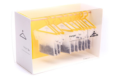
3: Creative Packaging
My favorite part about being a designer is the idea that we get the opportunity to work in every aspect of journalism -- news design, magazine design, promotional and even advertisements like these.
Wednesday, April 27, 2011
Response...Commission Nearly Complete
There were definitely times throughout the semester that I was frustrated with my commission project -- either photos weren't working out or designs were not coming out how I pictured them in my head. But not once did I regret taking this capstone. A lot of people told me it was competitive (which it is) and I was told I had to apply for other capstones, just in case (which I didn't); because since the moment I stepped onto campus and decided on a magazine emphasis I knew I was going to find a way to get into this capstone course -- I was going to be a designer and I was going to be good at it.
What I didn't expect from this capstone was to really see the impacts of working on this commission project. I thought we would be given a lot more direction; and now that we're nearly finished with them I'm actually rather happy that we weren't given a step-by-step guide to completing the prototype. Regardless of the role we played (Designer, Webbie, Publisher), we all learned first-hand what it was like to work for a magazine. While many of us have completed internships, I don't think any of us got quite as close to the whole package as we saw this semester.
I'm grateful for having been given this opportunity, because if nothing else, I learned that I am completely satisfied with where I'm headed in my career. Some people find something they like and end up not loving it -- but I found something I really enjoy that I think, in the long run, I am going to be continually happy with.
I can't wait to see everyone's final products!! Great work this semester everyone!
Critique...More Vox
Last month I critiqued my two Vox department spreads...this month I've got two single pages to share with you (photos to come).
The first one here is probably the quickest I've ever completed a department page. I suppose it's just one of those weeks when it all plays out well with the text, art, headline and ads. I was definitely grateful for that!
The second was a bit of a predicament because the story turned out to be such an awkward length given the quarter-page ad that was on it (yes, I know they're necessary -- but still don't have to like them) and that both the recurring sections were too long to fit in the excessive amount of white space I had. But I think it all worked out pretty great!
Only one more department to design for Vox -- it's been a great semester!
Wednesday, April 20, 2011
You Can't Miss...Inspiring Photos
I have recently become rather obsessed with Stumble Upon, so if you haven't been to this website -- do it now!
That said, one photography blog I came across had some great inspirational illustrations. I think in all that we've learned there is a lot to say in combining our abilities. Many of us have experience using a professional camera; and that, matched with our extensive use of typography for the last two semesters, would definitely reflect in our ability to create something like the samples I've provided below!
Plus, sometimes we just need a little pick-me-up!
Response...blog designs, my redesign
As I write this entry I wish I'd have taken a screen shot of my blog before I changed it -- but hind sight is 20/20 and it's probably better to just forget about what my blog looked like before this redesign.
After class I thought about what I wanted to do in redesigning my blog -- because I've been meaning to do so and have just not had any motivation to do so. That said, I took into account the comments I was given about my background and blog title color choices and opted for a more subtle, but still bright, turquoise.
In addition, when we discussed my name plate for the blog it was mentioned that I needed a blog description or a dek below my title. And as I explained in class -- I am not a huge fan of deks, because I feel the space can be better used. So to compromise my misuse of space and my dislike of deks, I created a new name plate in Photoshop that I believe reflects well on my title and takes care of my spacing issues!
Let me know what you think of the changes!!
Critique...being commissioned for work!
The illustration assignment has finally come around for the beginning design students this spring. For all of us that want to be designers it's a chance to do something completely crazy and unique -- but for the writers and editors in the class it's the kiss of death. Silver lining? They get the chance to in creative director's position and commission a designer to create their illustration.
The following is the illustration I created for a friend of mine. She did a great job as creative director and sat with me the whole time as I created the illustration. Her abilities to voice her opinions and give creative suggestions were impressive considering she didn't feel she had any creative talent.
The story is about college graduates that don't complete their full professional "evolution" -- rather than getting a job after graduation, getting married and having kids -- more and more college graduates are seeking other paths.
Wednesday, April 13, 2011
You Can't Miss...Heel Art
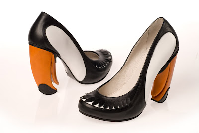
This week I took a break from my normal following of Smashing Magazine, because I can't help but share Kobi Levi's blog featuring her unique high heel designs. It amazes me when I realize that so much of everyone's life is determined by a designer -- the clothes/shoes we wear, the buildings we learn and work in, the cars we drive to get places...and, of course, the magazines we read obsessively!
Subscribe to:
Comments (Atom)


