Wednesday, April 27, 2011

You Can't Miss...Graphic Design Stumbles

Here's what happens when I try to blog and stumble at the same time: three awesome things for you all to checkout!

1: Google Logos

Ever visit Google and really like the design? Google has archived all their logos here


The idea for doodles (as the logos are called) was created in 1998 when founders Larry and Sergy toyed with the logo while attending the Burning Man Festival in Nevada. From there an intern, Dennis Hwang, was asked to create a doode for Bastille Day. Since then, "doodles on the Google homepage have made searching on Google more fun and enjoyable for its users worldwide." They are now used when news seasons start, important birthdays happen and on anniversaries!

2: Awesome Tutorials

I've always been the type of designer that does better at learning when I just test out the tools to see what it does. But incase you're looking for some specific directions, check out these tutorials by Tutorial Outpost! 


3: Creative Packaging

My favorite part about being a designer is the idea that we get the opportunity to work in every aspect of journalism -- news design, magazine design, promotional and even advertisements like these.  


Response...Commission Nearly Complete

There were definitely times throughout the semester that I was frustrated with my commission project -- either photos weren't working out or designs were not coming out how I pictured them in my head. But not once did I regret taking this capstone. A lot of people told me it was competitive (which it is) and I was told I had to apply for other capstones, just in case (which I didn't); because since the moment I stepped onto campus and decided on a magazine emphasis I knew I was going to find a way to get into this capstone course -- I was going to be a designer and I was going to be good at it.


What I didn't expect from this capstone was to really see the impacts of working on this commission project. I thought we would be given a lot more direction; and now that we're nearly finished with them I'm actually rather happy that we weren't given a step-by-step guide to completing the prototype. Regardless of the role we played (Designer, Webbie, Publisher), we all learned first-hand what it was like to work for a magazine. While many of us have completed internships, I don't think any of us got quite as close to the whole package as we saw this semester.


I'm grateful for having been given this opportunity, because if nothing else, I learned that I am completely satisfied with where I'm headed in my career. Some people find something they like and end up not loving it -- but I found something I really enjoy that I think, in the long run, I am going to be continually happy with.


I can't wait to see everyone's final products!! Great work this semester everyone!

Critique...More Vox

Last month I critiqued my two Vox department spreads...this month I've got two single pages to share with you (photos to come).


The first one here is probably the quickest I've ever completed a department page. I suppose it's just one of those weeks when it all plays out well with the text, art, headline and ads. I was definitely grateful for that!


The second was a bit of a predicament because the story turned out to be such an awkward length given the quarter-page ad that was on it (yes, I know they're necessary -- but still don't have to like them) and that both the recurring sections were too long to fit in the excessive amount of white space I had. But I think it all worked out pretty great! 


Only one more department to design for Vox -- it's been a great semester!

Wednesday, April 20, 2011

You Can't Miss...Inspiring Photos

I have recently become rather obsessed with Stumble Upon, so if you haven't been to this website -- do it now!

That said, one photography blog I came across had some great inspirational illustrations. I think in all that we've learned there is a lot to say in combining our abilities. Many of us have experience using a professional camera; and that, matched with our extensive use of typography for the last two semesters, would definitely reflect in our ability to create something like the samples I've provided below!

Plus, sometimes we just need a little pick-me-up!


Response...blog designs, my redesign

As I write this entry I wish I'd have taken a screen shot of my blog before I changed it -- but hind sight is 20/20 and it's probably better to just forget about what my blog looked like before this redesign.

After class I thought about what I wanted to do in redesigning my blog -- because I've been meaning to do so and have just not had any motivation to do so. That said, I took into account the comments I was given about my background and blog title color choices and opted for a more subtle, but still bright, turquoise. 

In addition, when we discussed my name plate for the blog it was mentioned that I needed a blog description or a dek below my title. And as I explained in class -- I am not a huge fan of deks, because I feel the space can be better used. So to compromise my misuse of space and my dislike of deks, I created a new name plate in Photoshop that I believe reflects well on my title and takes care of my spacing issues!

Let me know what you think of the changes!!

Critique...being commissioned for work!

The illustration assignment has finally come around for the beginning design students this spring. For all of us that want to be designers it's a chance to do something completely crazy and unique -- but for the writers and editors in the class it's the kiss of death. Silver lining? They get the chance to in creative director's position and commission a designer to create their illustration.

The following is the illustration I created for a friend of mine. She did a great job as creative director and sat with me the whole time as I created the illustration. Her abilities to voice her opinions and give creative suggestions were impressive considering she didn't feel she had any creative talent.


The story is about college graduates that don't complete their full professional "evolution" -- rather than getting a job after graduation, getting married and having kids -- more and more college graduates are seeking other paths.

Wednesday, April 13, 2011

You Can't Miss...Heel Art

This week I took a break from my normal following of Smashing Magazine, because I can't help but share Kobi Levi's blog featuring her unique high heel designs. It amazes me when I realize that so much of everyone's life is determined by a designer -- the clothes/shoes we wear, the buildings we learn and work in, the cars we drive to get places...and, of course, the magazines we read obsessively!


Response...Mini Portfolios

I think it's wonderful that we're getting the opportunity to create these mini portfolios. To be honest, I had never heard of a mini portfolio before -- which is probably another reason it's great I'm in this capstone course. We all have worked really hard on all of our work, and being able to compile it all together in another place -- other than a pile in our rooms or files on our computers.

It was really great to see other mini portfolios from semesters past, because it's true that all of our greatest was inspired by something that we saw someone else do. That's not to say I plan to copy someone else's mini portfolio, but I definitely got some great ideas that I plan to adapt into my own portfolio's design!

As for my mini portfolio, I am planning to pull the black and hot pink colors from my resume. I don't plan to have a black cover or black pages, but those two colors will be prominently used in my designs. I understand that some individuals don't think hot pink is a serious enough color for my resume or my mini portfolio, but I am a girl with a lot of personality who happens to also love bright colors. I think it is important to wear our personality proudly in our resume/portfolio as well as in our designs.

Critique...Shindig is coming close to the end!

With next week being the final week that we will be working on our commissioned pieces, I thought it would be nice to critique what we've ended up with! We've all being working extremely hard on our designs and I think we're all looking forward to seeing the final pieces after they've been printed.

Departments

Cheers, Baking with Booze: After a bit of concern about how many recipes we were planning on including and then determining the art (it's always the art that seems to be the issue) we landed on three awesome recipes and some great photos, including one I shot myself (a unique, textured border for the top of the right page).

Feast, Basket Case: This spread was definitely not a picnic, but it is one of our most well written pieces from the entire magazine. One difficultly we've had in discussion with our publishers is how reasonable it would be to find artwork for our spreads when we are given very little resources outside of the photo database we are granted permission to and actually shooting the photographs ourself.

Mingle, Hostess Guide: Vintage was our goal and, with the help of Etsy.com, we were able to find great art for our hostess gifts and as I see it, the spread turned out a lot like a product spread I would see in a department of a real magazine.

Flair, Make It or Break It: This is BY FAR my favorite of all the spreads I designed for Shindig. The photo, taken by me, turned out exactly how I had pictured it in my head. I'm not sure about everyone else, but rarely does it actually turn out how I see it in my head. 

Features

Luxe for Less: Lucky us! We found a wine bottle that fit our design needs perfectly. Because, while Photoshop is a wonder and I'm sure I have much to learn about it's capabilities -- I am not a wiz at turning a standard wine bottle into a silver and black one. I say lucky us, because we happened to find one while at one of our photo shoots for the project! That addition to the spread, and a change of color palette completely transformed this piece into another one of my favorites.

Game On: Unfortunately, we got the text for this piece a little late, so we're running behind on the designs, but they're going well and will definitely be ready come the end of next week!

Photos to come after we've submitted our final pieces!!

Wednesday, April 6, 2011

You Can't Miss...Designing Futures

The more I've been exposed to new ways of designing I have begun to wonder what's coming next. Growing up laptops were new and iPods were nonexistent. This week on Smashing Magazine I read a post on the future of web design. They discuss how Google would equivalently taken 30 days to send a response if it had existed 100 years ago.


"Services such as Facebook, Twitter and LinkedIn are becoming the hub for our online life, and we are blending them to create our own unique Web of content: Facebook for our social life, LinkedIn for our professional life, Spotify for music, Netflix for television and film."


"The key rules to bear in mind when working through a design for the portable Web:
  1. The website should be available to as wide an audience as possible;
  2. The website should contain the same content wherever it is viewed, where feasible;
  3. The website’s structure should be the same wherever it is viewed;
  4. The content should be displayed in a manner that is appropriate to its environment.
A website that meets all of these criteria would fit snugly in the future portable Web."

Response...Spring Break Photos

I think we all know the styles that inspire us, but rather than take a photo of an interesting item that I saw while on break, I took photos that inspire me to design. They are things that make me happy, silly things that only a designer would notice and simple experiences that reflect the way I am as a designer.


Critique...Spring Break Typography

As I've mentioned before and I'll mention again, I want to live in New York City more than any other place on earth...so it's no surprise that I chose to spell out "New York City" for our spring break typography assignment.
The way I see it...the photos may have been taken in Chicago and spell New York, but it reflects me because I will find a way to make a life for myself in New York despite being a Chicago girl at heart.


Here are the originals from the typography assignment:


Tuesday, March 22, 2011

You Can't Miss...Tips I Wish I Knew, But Already Know

In the last year I have spent more time using Creative Suite programs than anyone other program I've used in my lifetime. This week on Smashing Magazine they had a post about tips on InDesign that designers wished they knew -- what I loved about it was the fact that I knew how to do all but a few of the tips. There's nothing like knowing that you've chosen the right career path -- and the idea that I knew how to do a lot of what others find to be "new" is great!


My favorite that I already knew...saving color swatches and loading new ones.
For a designer with a color-centered personality, I knew all about this tip about 30 seconds into opening InDesign for the first time. Maybe they should name the next color library after me ;)


A new one for me...master pages.
I knew that InDesign had a master page capability -- but, to be honest, I had no idea what the purpose was in the slightest. Now I know that if all my pages need to have a number of elements that are the same all I have to do is save them to the master page!


Check out all the other tips in the post and see how many you know -- but like they close with, know that as designers the best way to learn the "tips" of InDesign is to open the program and just start trying to make it work!

Critique...Vox Departments So Far

My first weekend designing for Vox Magazine was rather stressful -- as if not knowing what I was doing wasn't enough, I spent 48 hours freaking out about an illustration that I was supposed to make for the online version of the story I had to design. I didn't know the game in the story and the reporter was refusing to speak to me. I finished the following flash graphic (below is a photo, not the graphic) for the story and the page design, to come to find out there was an ethical issue -- the story wasn't printed and neither was my graphic. I still plan to use it in my portfolio.

Second round of Scene designing went a lot smoother -- though having my feature the same weekend did make it a bit crazy. It was fun, though, I enjoyed getting through all the stories and piecing it all together. 

Third round of Vox designing was another splash of change with the travel issue -- which was definitely a good time -- but when were told to stick with the personality of Vox in our designs it's hard to keep consistent when we only design every three weeks. Over all, this third week was my favorite because it was my type of content. I love to travel and it made me think of the idea that some day I could be designing for a travel publication's department pages.


Response...Prototype Drafts

Here's my thoughts...


Nosh
Talk about some great work! This team has really got it together for Tuesday; which has definitely motived us at Shindig to put out some great work for Thursday. I agree with their publishers on the red/green cover; though I see what you mean on the rust color -- I just the green needs a little adjusting though.

Plaid Dad
Just keep in mind that it is ultimate your design -- I know the logo you went with was the publisher favorite, but some of your other options I felt were significantly better. Overall, you've got a great start. I hope something gets worked out on the crazy gadget pages, though!


Modern Midwest
I definitely think taking a stab at your own photography is the only way to go. It'll take a bit of extra work, but if you really take the time to plan it out and frame the photos well then I think it could turn out wonderful.


Cupboard
The style of you chose for your nameplate was great -- but I have to agree with Jan's comment about the "C" being rotated slightly. I know that you did that you make the name plate different, but it looks more out of place and than meaningful.


Shindig
Here's where your comments come into place...we'd love the feedback. 

Wednesday, March 16, 2011

You Can't Miss...The User Experience

Yesterday's post on Smashing Magazine starts by saying: "A lot of designers seem to be talking about user experience (UX) these days. We’re supposed to delight our users, even provide them with magic, so that they love our websites, apps and start-ups. User experience is a very blurry concept. Consequently, many people use the term incorrectly."
What's crazy about this model that they discuss is that I see both sides of the spectrum. Growing up I was the user -- so I chose my magazines based on what I saw on the cover as it related to me because that made me like the product and it had the special appeal. But now that I'm at Mizzou I have been taught to focus on those first four product features as a designer: content (always content...that has been drilled into my head over the last four years), presentation, functionality and interaction. And as far as the center section is concerned -- both the designers and the users manipulate, stimulate and identify each other, which is why I believe both parties take part in that step of the model.


What's most important in this post however, was the final section -- telling us that we can not design the user experience because we can not design the use. However, we can design for the user -- and that was the plan all along.

Response...Potential Portfolio Pieces

We've all taken basic design -- so seeing the projects from that course was familiar. We've also all taken part in Vox department pages and designing logos. What I most loved about showing off my own work and seeing the work of other was to see what everyone has done outside the realm of required Magazine Design courses.


I was able to show my designs for my work with Relay For Life at Mizzou...


In addition to the infographics I did for the Missourian...


And the wireframes I created on behalf of the Museum of Art & Archaeology in my application development class...


Each of us as an idea of what our lives and careers are going to be like after we graduate. For most of us, that time will come in under two months. Many, including myself, see ourselves in New York City -- others plan to stick around for grad school among other reasons. And those differences are what our designs show. We can take the idea from a brainstorming session or be inspired by a part in the stories we design, but we each carry our own personality throughout our designs. Not only was this critique session beneficial to our portfolios, but they gave us a chance to get to know each other through our designs.

Critique...Logos Through the Drafts

The number 20 didn't seem that big when it was my age or when it was the number of miles I'd driven on my 432-mile drive home, but designing 20 logos is a lot harder than I expected. In hours I spent on designing my first drafts I came up with a handful right off the bat; I thought I was home-free -- I still had 14 more to design. I stuck with the color red in my first drafts because I've grown up visualizing black and red as a combination of colors that were bold...strong...unbreakable. And when I think of the women and minorities that the Sports Journalism Institute support, I can only imagine how tough they've got to be to make their careers happen. So here's what I started with:


Round two we were told to narrow the field to five logos. The following were my top five and how they changed from the original drafts to the final five. Note: the ORIGINAL is on the far left of each.


Choice 1: Received 2 votes during the in-class selection.


Choice 2: Received 5 votes during the in-class selection.


Choice 3: Received 9 votes during the in-class selection.


Choice 4: Received 4 votes during the in-class selection. As you can see, I opted for a brand new logo -- I now think they look like baby rattles. 


Choice 5: Received 3 votes during the in-class selection.


And in the final drafts our five selections were brought to two choices with the help of Greg Bowers.

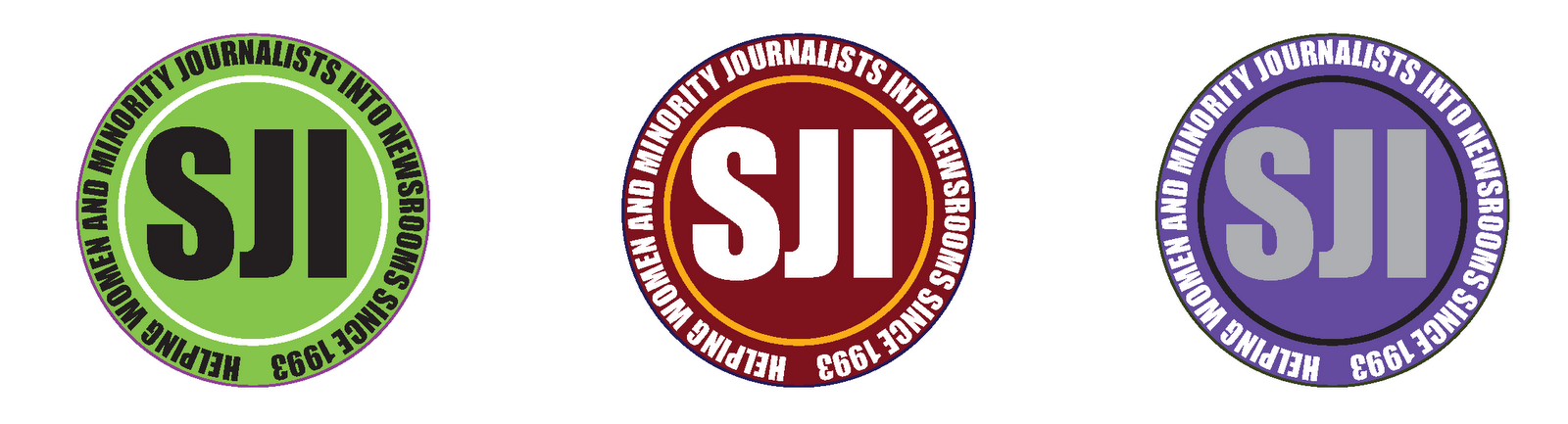
Choice 1: For this logo I wanted to take on the image of designing a seal for the institute, because when I think of an institute I think they must have a seal of some sort -- University of Missouri has one, it's displayed in the Student Center as a remembrance of Brady Commons.

Choice 2: Sports are all about motion -- there's constant movement, even when athletes take a moment to breathe. I designed this logo around that motion and took into effect the way the motion encircles the team; hence, the motion is encircling the name plate. As for color (in both logos), I was told that symbolism was not as powerful as color -- so I chose colors that were vibrantly different, dark with contrast, and lastly a resemblance of skin colors.